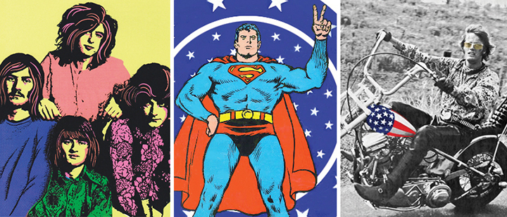
How did adolescents express themselves before Spacebook and Instatweet?
When I was a little (non) shaver, there weren’t many avenues of expression available. One way we did it was with posters. There was an actual head shop at the local mall – with bongs, rolling papers and everything – and plenty of ’em on the Wildwood boardwalk. We’d buy posters there that we believed somehow reflected our values and aspirations, and hung ’em in our bedrooms. Yeah, it was thin, but that’s what we did.
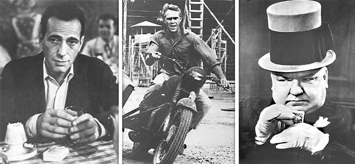
These three posters – from left, Humphrey Bogart, Steve McQueen and W.C. Fields – were marketed. I didn’t buy them, but I remember them. I think there was a James Dean one, too. I didn’t really know who these guys were; I wasn’t a movie buff yet. There was also one of Frank Zappa sitting on a toilet, with the headine “Phi Zappa Krappa.” (You can find it on the Google; I didn’t want to put it up, ’coz it’s kinda nasty.)
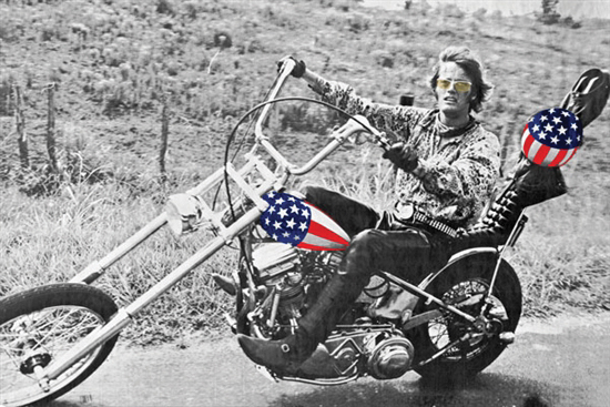
This poster – Peter Fonda in “Easy Rider” in black-and-white with “spot” color on the gas tank and shades – is my favorite. I still have my original, which followed me from grade school to college to adulthood. A coupla years ago, I unrolled the poster, which was as tattered as the Scroll of Toth. I then flattened it for a week in the garage under heavy books. Somehow, I got what’s left of it into a frame without further damage. So I can still enjoy the original that I thought was so cool; it inspired me to paint the gas tank on my mini-bike in a U.S. flag design.
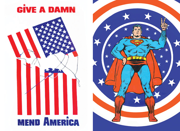
People forget how the U.S. flag permeated pop culture after “Easy Rider.” Youth-targeting marketeers used (abused?) the flag in ironic ways. I had a stars-and-stripes wall clock from Spencer’s Gifts. Spiro Agnew wristwatches were everywhere. My little brother had a red, white and blue bedroom – in paneling, paint and shag carpet.
Anyway, I had both of the posters above. “Give a Damn, Mend America” is a head-scratcher, politically. (I bought it because I dug the U.S. flag motif.) The Superman one – illustrated by, I would guess, Curt Swan and Murphy Anderson – really mixed it up with a flag design and Supes giving the “peace” sign. Also a politcal head-scratcher. Doesn’t Supes represent the Establishment? Doesn’t the red, white and blue reinforce this? Then why is he making like a hippie?
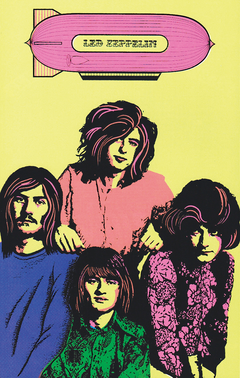
Can you believe this was a Led Zeppelin poster? It looks all psychedelic. But don’t forget, Zep’s first album came out in 1969, during the height of grooviness. Still, you can’t mistake the songs on “Zep I” as being groovy, with the possible exception of “You’re Time is Gonna Come” – groove-wise, not lyrics-wise. Anyway, I had this poster before I even knew who Led Zeppelin was.

This one of Raquel Welch from “One Million Years B.C.” is the poster that launched a million … never mind. It had, and still has, a profound effect.
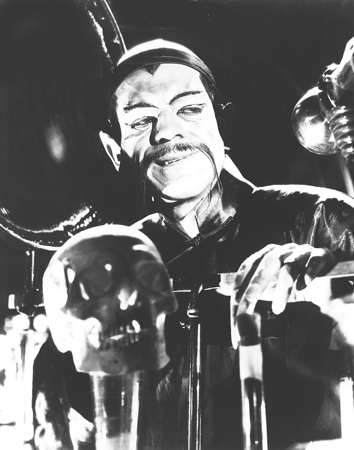
There are many other stills and portraits of my favorite actor, Boris Karloff, that would have made a better poster than this image from 1932’s “Mask of Fu Manchu.” But it was a Karloff poster, after all. For years, I would annually pencil “DOM III,” “DOM IV,” “DOM V,” etc., somewhere discreetly on the poster. “DOM” stood for “Day of Mourning.” I would do this on the anniversary of Karloff’s death. So, for instance, “DOM III” was written onto the poster on Feb. 2, 1971.
Yeah, I was a hopeless nerd.
I also hung the gigundo poster of Chicago from the quadruple (yes, I said quadruple) live album, “Chicago at Carnegie Hall” (1971). That poster ate up a lot of wall. And I had a few DayGlo posters – Viking girls and a psychedelic “Peace” design.
(Sigh) Those were the daze.